

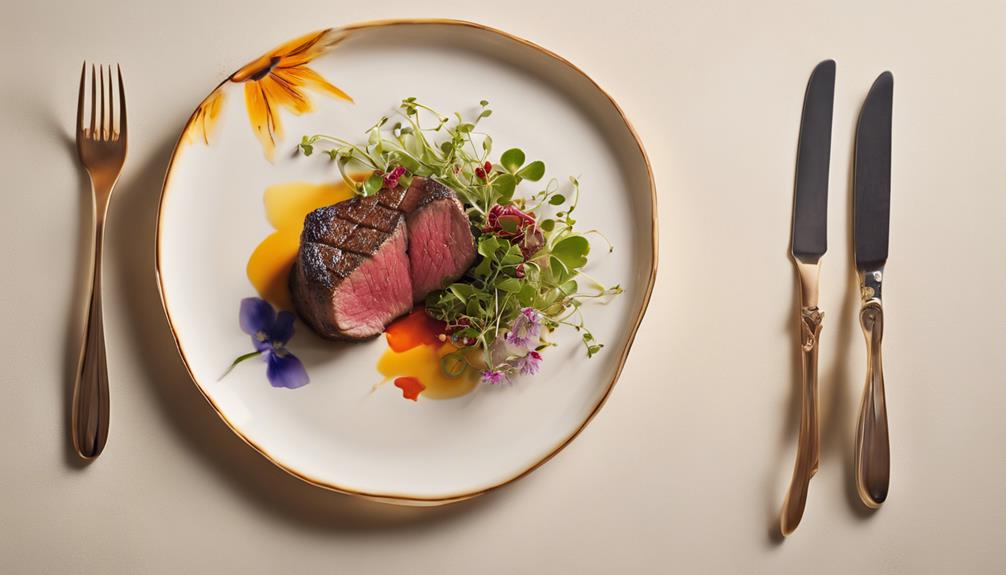
As a chef, I've learned that crafting beautifully plated dishes is an art form that requires careful consideration of visual balance, color harmony, and texture. I choose plates that complement the dish, select garnishes that add a pop of color and flavor, and balance heights and textures to create visual interest. I experiment with different plating styles to reflect the cultural identity of the cuisine. By paying attention to every detail, from the freshness of herbs to the arrangement of sauces, I can create a dish that's almost too beautiful to eat. There's still so much to discover when it comes to plating…
Understanding Visual Balance
How do I create an aesthetically pleasing dish that captures the diner's attention to the most significant elements? For me, it all begins with grasping visual equilibrium. I think of it as narrating a tale on a plate, where every component serves a purpose and contributes to the overall beauty. It's about establishing harmony and directing the diner's gaze through the dish.
I achieve this by applying principles of visual arrangement and color theory. I consider the rule of thirds, symmetry, and negative space to establish a sense of equilibrium. I also contemplate the colors I'm using and how they'll interact with one another. Bold colors like reds and oranges can attract attention, while serene colors like blues and greens can evoke a sense of tranquility. By balancing bold and serene colors, I can generate visual appeal and dimension.
Regarding plating techniques, I concentrate on crafting a distinct focal point. This could be a splendidly prepared protein or a colorful garnish. I utilize presentation techniques like height, texture, and design to introduce visual appeal and establish a sense of motion on the plate. By thoughtfully arranging each component, I can create a dish that's not just delectable but also a delight for the eyes. By excelling in visual equilibrium, I can elevate my dishes to the next level and deliver an unforgettable dining experience.
Choosing the Right Plate
As I approach the final stages of plating, I view the plate itself as a canvas, ready to be paired with the culinary masterpiece I've crafted. It's essential to select the appropriate plate that complements my dish, instead of dominating it. I begin by considering plate size. A smaller plate can make a delicate dish seem more substantial, whereas a larger plate can offer ample space for a heartier meal.
Then, I take into account the rim design. A plate with a wide, flat rim can offer a clean, modern appearance, whereas a plate with a decorative rim can add a touch of sophistication. The material of the plate is also significant. Ceramic plates can bring warmth and coziness, whereas glass or porcelain plates can offer a sleek, refined look. I choose a plate that not just complements the colors and textures of my dish but also mirrors the overall atmosphere I aim to convey.
The shape of the plate is also a crucial factor. A round plate can create a sense of balance, whereas a square plate can introduce a modern touch. I select a plate that mirrors the shapes and lines present in my dish, establishing a sense of continuity and visual flow. By choosing the appropriate plate, I can enhance my culinary creation from mere food to a piece of art that pleases the senses.
Selecting Harmonious Colors
As I approach the art of plating, I know that selecting harmonious colors is essential to creating a visually stunning dish. I've found that a balanced color palette can enhance even the simplest ingredients, whereas nature-inspired hues can add an organic, earthy feel to the plate. By thoughtfully choosing colors, I can create a cohesive look that draws the diner's eye to the culinary masterpiece.
Balanced Color Palette
I consider a balanced color palette vital to creating visually stunning dishes, as it enriches the overall aesthetic appeal and makes the food more appetizing. A well-thought-out color scheme can uplift even the simplest of dishes, making them Instagram-worthy and increasing the chances of diners wanting to dig in.
To achieve artistic balance, I keep the following tips in mind:
- Contrasting colors: I pair bold, vibrant colors with neutral shades to create visual interest and prevent overwhelming the senses.
- Plate shape: I choose a plate shape that complements the colors and textures of the dish, ensuring harmony between the two.
- Color harmony: I select colors that work together in harmony, whether it's through analogous, complementary, or triadic color schemes.
- Accent colors: I add pops of accent colors to draw attention to specific elements of the dish, adding depth and visual appeal.
Nature-Inspired Hues
Selecting harmonious colors inspired by nature's palette is a great way to create a visually appealing dish that evokes feelings of serenity and freshness. I find that incorporating earthy tones, such as sage green, terracotta, and sandy beige, adds warmth and coziness to my dishes. These natural hues complement the natural shapes of ingredients, like the curves of a perfectly roasted vegetable or the delicate petals of a fresh herb.
To take my dishes to the next level, I love drawing from seasonal colors and organic patterns. In the fall, I might use rich oranges and yellows to evoke the feeling of changing leaves. In the spring, I might opt for soft pastels that reflect the gentle hues of blooming flowers. By doing so, I can create a sense of time and place that makes my dishes feel more intimate and connected to the natural world. By embracing nature's palette, I can craft dishes that taste amazing and tell a story, evoking a sense of wonder.
The Power of Garnishes
Garnishing my dishes with fresh herbs and edible flowers has enriched my culinary creations from usual to captivating. It's amazing how a simple sprig of rosemary or a delicate violas petal can enhance a dish from bland to grand. I've discovered that garnishing is not just about adding a pop of color, but about telling a story and evoking emotion.
I love experimenting with garnish creativity and variety. I've found that combining unexpected herbs and flowers can create a unique and memorable flavor profile. For instance, pairing sweet basil with tangy lemon balm adds a bright and invigorating touch to summer salads. Here are some of my favorite garnish tips:
- Mix and match: Combine different herbs and flowers to create a one-of-a-kind flavor and visual experience.
- Consider the theme: Choose garnishes that reflect the dish's inspiration, such as using lemongrass for a Southeast Asian-inspired curry.
- Don't overdo it: A single, perfectly placed garnish can have more impact than a cluttered plate.
- Play with texture: Combine soft herbs with crunchy flowers or nuts for added depth and interest.
When it comes to garnish placement, I believe it's all about balance and harmony. A well-placed garnish can draw the eye to the most appealing parts of the dish, while a poorly placed one can distract from the overall aesthetic. By thoughtfully considering garnish creativity, variety, placement, and impact, I've been able to take my dishes from usual to extraordinary.
Building Height and Texture
By balancing garnishes with clever height and texture variations, I can add an additional layer of sophistication to my dishes, drawing the diner's eye on a journey through the plate. It's all about creating visual interest and depth, which I achieve by adding dimension through cleverly placed elements. A delicate sprig of rosemary, for instance, can add a subtle yet striking contrast to a rich, velvety sauce.
Playing with height is another trick up my sleeve. I love stacking ingredients to create a sense of drama, like piling crispy vegetables on top of a tender filet or arranging a delicate tower of meringue kisses. The key is to balance the composition, ensuring each element complements the others without overwhelming the plate.
Embracing textures is also crucial. I adore the tactile experience of combining crunchy, smooth, and soft elements, like the satisfying crunch of toasted nuts against the silky smoothness of a perfectly cooked scallop. By mixing and matching different textures, I can create a sensory experience that engages the diner on multiple levels.
When I get it just right, the result is nothing but magical. The diner's eye dances across the plate, taking in the visual feast before them. It's a delicate balance, but one that's well worth the effort. With a little creativity and practice, anyone can master the art of building height and texture – and enhance their dishes to new levels.
Symmetry and Asymmetry
As I consider the art of plating, I realize that achieving balanced visual appeal is essential, and that's where symmetry and asymmetry come into play. I've found that strategically placing creative elements can make or break the harmony of a dish, and it's a delicate balance I aim to master. By embracing harmony in disorder, I can create plates that are both visually stunning and thoughtfully composed.
Balanced Visual Appeal
I endeavor to create visually stunning dishes by intentionally balancing symmetry and asymmetry to direct the diner's eye through the composition. This delicate balance is essential in crafting beautifully plated dishes. When I'm plating, I consider the visual weight of each element, making sure that no single component overpowers the others. I also play with color contrast to add depth and visual interest.
Here are some key considerations I keep in mind:
- Negative space: I make sure to leave some breathing room on the plate to avoid clutter and create a sense of harmony.
- Focal point: I designate a central element, like a beautifully seared protein or a lively garnish, to draw the diner's attention.
- Visual flow: I arrange the components to guide the diner's eye through the dish, creating a sense of movement and energy.
- Balance and harmony: I aim to create a sense of balance and harmony by distributing the visual weight and color contrast thoughtfully.
Creative Element Placement
Fresh herbs, delicate microgreens, and artistic garnishes become the brushstrokes of my culinary canvas as I thoughtfully place each element to create a visually stunning composition. I'm not just plating a meal; I'm crafting a work of art. Symmetry is often the default, but I love to experiment with asymmetry, too. It adds a touch of whimsy, a dash of personality to the dish. My artistic arrangement might feature a delicate flower petal placed off-center, or a sprinkle of microgreens that creates movement on the plate. I'm not afraid to try unconventional designs that push the boundaries of traditional plating. The key is to balance the elements in a way that creates harmony, even in the most playful presentation. I want my dishes to evoke a sense of wonder, to delight the senses before the first bite is even taken. When I plate a dish, I'm telling a story, and I want that story to be one of creativity, passion, and joy.
Harmony in Disorder
One of the most intriguing aspects of crafting beautifully plated dishes is finding harmony in disorder, where symmetry and asymmetry converge to create visually stunning compositions. It's about embracing the beauty of chaos whilst maintaining a sense of artistic elegance. When I'm plating a dish, I'm not just placing ingredients on a plate; I'm creating a visual experience that tells a story.
- I balance bold colors with neutral tones to create visual interest.
- I use varying textures to add depth and dimension to the plate.
- I play with negative space to create a sense of simplicity and sophistication.
- I experiment with different heights and angles to add movement and energy to the composition.
Balancing Flavors and Textures
Crafting a harmonious dish requires balancing flavors and textures, which is where the art of layering and contrasting comes into play. When I'm building a dish, I think about how each component will interact with the others. It's not just about throwing a bunch of ingredients together; it's about creating a symphony of flavors and textures that will delight the palate. I experiment with flavor pairings, combining sweet with savory, tangy with umami, to create a depth of flavor that's hard to resist. But it's not just about the flavors – texture contrast is just as important. Crunchy and smooth, soft and crispy – the variations are endless, and the right combination can enhance a dish from good to great.
As I plate my dish, I consider color coordination and visual presentation. I want the colors to pop, to create a visual feast that's almost too beautiful to eat. Almost. I arrange the ingredients in a way that creates movement, that draws the eye around the plate. It's all about balance – balancing flavors, textures, and colors to create a dish that's greater than the sum of its parts. When I get it right, it's like magic – the flavors meld together, the textures complement each other, and the presentation is stunning. It's a harmonious whole, a dish that's both beautiful and delicious.
Creating Visual Flow
As I arrange the ingredients on the plate, I'm mindful of creating visual flow by guiding the diner's eye through the composition. I want the dish to tell a story, to evoke emotion, and to create a sense of harmony. To achieve this, I consider the principles of visual movement and focal point. I place the most striking elements, like a lively sauce or a delicate garnish, in a way that draws the eye to the focal point of the dish.
Here are some tips I keep in mind:
- Balance complementary shapes: I pair rounded elements, like a scoop of mashed potatoes, with angular ones, like a slice of seared fish, to create visual interest.
- Use negative space effectively: Leaving some areas of the plate empty creates a sense of breathability and allows the eye to rest.
- Create a visual pathway: I arrange ingredients in a way that guides the diner's eye through the dish, using lines, shapes, and colors to create a sense of flow.
- Play with heights and textures: Varying the heights and textures of the ingredients adds depth and visual interest to the dish.
Plating for Different Cuisines
When it comes to plating various cuisines, I adjust my composition methods to mirror the distinct cultural and visual identities of each cooking style. For example, when plating Japanese dishes, I highlight simplicity and minimalism, often utilizing empty spaces to establish a sense of balance. On the other hand, when dealing with Indian or Middle Eastern cuisine, I include vivid hues and daring patterns to represent the diverse cultural impacts of these regions.
Regarding traditional presentation, I honor the timeless techniques that have been handed down through generations. For instance, a beautifully arranged Beef Wellington or Coq au Vin showcases the enduring grace of French cuisine. Yet, I also relish experimenting with fusion cuisine, enabling me to blend various cultural influences and plating methods to invent something completely fresh and inventive.
Ultimately, the secret to successful plating is grasping the cultural background of the cuisine you're handling. By doing so, you can create dishes that taste fantastic and also narrate a tale about the individuals and customs behind the food. Whether you're dealing with traditional or fusion cuisine, the objective is always to craft a visually impressive dish that pays homage to the cultural inspirations that sparked it. By adjusting my plating methods to mirror the distinct characteristics of each cuisine, I can produce dishes that are both exquisite and significant.
Adding Fresh Herbs and Edible Flowers
I often enrich my dishes by incorporating fresh herbs and edible flowers, which add vibrant pops of color and introduce subtle, nuanced flavors. These delicate touches elevate my culinary creations, making them delicious and visually stunning. When selecting herbs and flowers, I consider seasonal pairings to make sure that the flavors and aromas complement each other perfectly. For example, I enjoy pairing fresh basil with sweet cherry tomatoes in the summer or using fragrant rosemary with roasted vegetables in the fall.
Here are some of my favorite ways to incorporate fresh herbs and edible flowers into my dishes:
- Microgreens: I use these young, nutrient-dense greens to add bursts of flavor and color to salads, soups, and sandwiches.
- Floral accents: Edible flowers like violas, pansies, and nasturtiums add a touch of whimsy and elegance to desserts, salads, and cocktails.
- Herbal infusions: I infuse herbs like mint, lemongrass, and chamomile into oils, vinegars, and teas to create unique flavor profiles.
- Artistic arrangements: I arrange fresh herbs and flowers in intricate patterns on the plate, creating a feast for the eyes and the taste buds.
Paying Attention to Portion Control
By balancing flavors and textures, I ensure that each bite is satisfying, which leads me to focus on portion control to create harmonious, well-composed dishes. This is where the art of presentation style comes in – it's about more than just piling ingredients on a plate. I consider the portion size, ensuring each serving is generous yet not overpowering. I want my guests to feel like they're getting a complete experience, neither too little nor too much.
Food styling is a crucial aspect of portion control. I visualize the dish as a whole, thinking about the arrangement of ingredients, the negative space, and the visual flow. I ask myself, 'Will this serving size showcase each component beautifully?' or 'Will it look cluttered and chaotic?' I adjust the portion size accordingly, making sure each element shines.
Serving sizes can greatly impact the overall aesthetic of the dish. A delicate sauce, for instance, might call for a smaller portion to prevent it from dominating the other ingredients. Conversely, a hearty stew might require a more generous serving to showcase its rich flavors. By paying attention to portion control, I can create dishes that are not just delicious but also visually stunning. It's all about finding that perfect balance, and with practice, I've developed an intuition for what works and what doesn't. The result is a beautifully plated dish that tells a story and invites my guests to take a bite.
Finishing Touches and Final Details
As I put the finishing touches on each dish, I carefully consider the garnishes, sprinkles, and other embellishments that will enrich the presentation and add a touch of personality to the plate. This is where my culinary creativity shines, and I get to infuse each dish with a hint of elegance. I take great pride in ensuring that every element on the plate complements the flavors while also creating a visually stunning arrangement. Whether it’s a delicate drizzle of sauce or a scattering of fresh herbs, these small details make a significant impact. Just like beautifully decorated cakes, each dish is thoughtfully crafted to delight both the eyes and the palate.
The final details can make all the difference in elevating a dish from ordinary to extraordinary. I take pride in my edible artistry, ensuring that every element on the plate tastes amazing and looks stunning.
Here are some of my favorite finishing touches:
- Microgreens for a burst of color and added freshness
- Artfully arranged sauces to create visual appeal
- Delicate sprinkles of edible gold dust for a hint of luxury
- Fresh herbs to add a fragrant and rustic charm
These elegant touches not only add visual appeal but also demonstrate my attention to detail and dedication to creating a memorable dining experience. As I plate each dish, I'm not simply presenting a meal – I'm crafting a work of art that will delight the senses and leave a lasting impression. With every finishing touch, I'm infusing a dash of personality to the plate, making each dish a true reflection of my culinary creativity and passion for edible artistry.
Frequently Asked Questions
Can I Plate a Dish in Advance or Just Before Serving?
Regarding plating, I always wonder if I should do it ahead of time or right before serving. Honestly, I've found that timing is everything. If I plate too early, the dish can lose its freshness and appeal. Instead, I like to prep my ingredients and then assemble the dish just before serving, utilizing plating techniques and presentation tips to create a stunning visual effect that wows my guests.
How Do I Prevent Sauces From Running on the Plate?
When I'm plating, I hate it when sauces start running all over the plate – it's such a mood killer! To prevent this, I make sure to place my sauces strategically, using a small pool or a thin line to add visual appeal. I utilize garnish techniques like dollops or small pours to keep things contained. And, let's be honest, a well-designed plate with some color contrast can work wonders in distracting from any potential sauce mishaps!
Are There Any Specific Plating Rules for Vegetarian or Vegan Dishes?
In terms of vegetarian or vegan dishes, I like to create a visual harmony that celebrates the natural beauty of the ingredients. I balance texture and color contrast by combining crunchy, smooth, and soft elements. I place garnishes thoughtfully to draw the eye to the star of the show. And, I choose plate shapes that complement the dish's shape and size. It's all about creating a feast for the eyes as much as the taste buds.
Can I Use the Same Plating Style for Different Types of Cuisine?
Can I really get away with using the same plating style for every type of cuisine? I've often wondered if my go-to arrangement would translate seamlessly from Japanese to Italian, or if it's a recipe for disaster. Honestly, I think it's a delicate balance between plating consistency and cultural considerations. Amid my desire for cohesion, I want to respect the unique essence of each cuisine. It's a culinary tightrope I'm still learning to walk.
How Do I Ensure My Dishes Look Good in Different Lighting Conditions?
When I'm styling a dish, I think about how it'll look in different lighting conditions. I consider the color contrast – will the colorful veggies stand out or get lost? I adjust the garnish placement to create visual interest. And I choose a plate size that won't overpower or disappear in the surroundings. I'm mindful of how reflection can impact the overall aesthetic, too. By planning ahead, I can guarantee my creations shine, no matter the lighting.